Friday, April 18
A Curated Gallery of Beautiful Fonts for Creative Designers
39,832 Premium Fonts


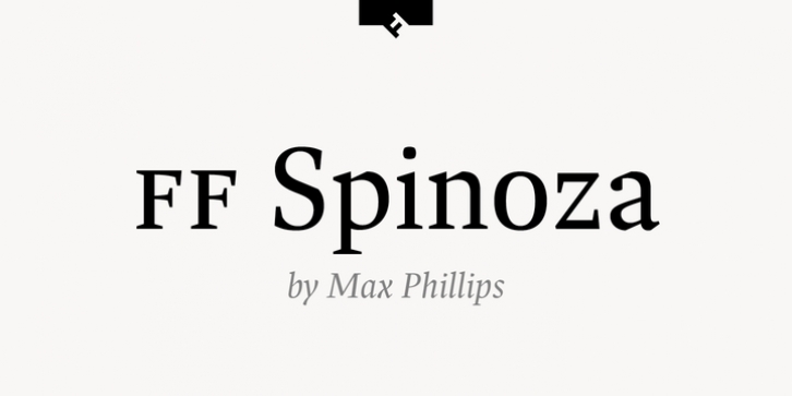
 11 years in the making, FF Spinoza is an elegant workhorse: crisp, sturdy, economical, and versatile. It was named after 17th century philosopher and lens-grinder Baruch Spinoza, who sought through both his professions to help people see clearly. A classic and highly readable Antiqua, it was inspired by the rigor of mid-century German text faces like Trump Mediaval and the lucidity of Janson revivals like Monotype Ehrhardt. Its x-height and aperture are generous, its proportions are compact, and its contrast is relatively low. Robust thin strokes and pronounced serifs and terminals make it suitable for setting in small sizes under challenging conditions, both in print and on the Web. Abruptly tapered junctures keep characters sharply defined and, in the heavier weights, create enlivening light traps. Substantial shoulders join branches and bowls firmly to their stems, which helps avoid the ‘picket-fence’ effect sometimes created by daintier typefaces. A comprehensive set of diacritics provides support for over 130 languages in the Pro version. Tabular figures are uniform in width across all weights to aid in the setting of columnar matter.
