Wednesday, April 16
A Curated Gallery of Beautiful Fonts for Creative Designers
39,832 Premium Fonts

Wednesday, April 16
A Curated Gallery of Beautiful Fonts for Creative Designers
39,832 Premium Fonts


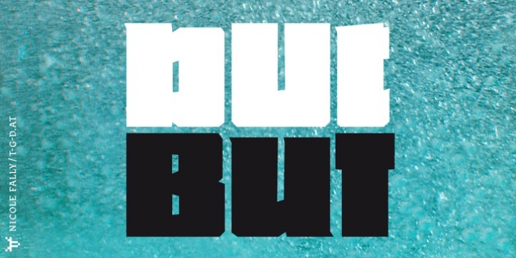
 Bold, black and square. But was first drawn as a logotype for the magazine "BUT – Bilder und Texte" (pictures and texts) which was published by an experimentally-oriented non-commercial initiative. In consideration of the unusual dimensions of the magazine (6 x 14 cm / 2,4 x 5,5 inch), I decided to fill as much space as possible with the body of type. This formal idea refers to the meaning of the title by blurring the border between legible letters and abstract shapes.
